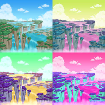
Movement

By ruby
morrismusic
Bandcamp
YouTube
YouTube
Omega_Morris123
Twitter
←
Dusksetter
Previous track by this artist
→
Penumbral Awakening
Next track by this artist.
Cover art by Kett
kettleskanvas
DeviantArt
kettleskanvas.com
Other
←
Waltz in A Minor "Homestuck" (Op. 9)
Previous track art by this artist
→
Dance of Storms
Next track art by this artist.
Released 9/16/2023.
Duration: 2:46.
Listen on Bandcamp or YouTube.
Read artist commentary.
Tracks that Movement references: Tracks that this one references:
Artist commentary:
ruby:
I got the idea for this song when submissions for LOFAM 5 Act 2 opened up. Something cinematic, related to a land or something idk. After finishing the song, Ucklin gave some feedback in regards to adding a lead melody. Though, any lead melody I tried adding felt out of place, so in the end I left it as-is.
I'm really glad that I was able to get in 3 submissions that were all in completely different styles, and also, as this was my first time submitting anything for lofam, genuinely surprised all of my submissions made it in! I got into Homestuck in late-2020/early-2021, so I'm glad the fandom's still doing awesome things like this and it's an honor to be involved :)
Kett:
The Music artist mentioned the idea of something cinematic relating to a land, so when I listened to the song I could immediately picture a picturesque land with flowing water and trees, seemingly floating high in the sky.
References to Sburban Jungle, Dawn of Man and funnily enough Cascade (albeit more to the name rather than the flash) helped create that seemingly new, naturalistic looking world with cascading waterfalls; untarnished by any kind of machinery or man made structures. This of course doesn't mean the land is void of any kind of threats, there are certainly dangers lurking within the dense forests, but from an outside view it would seem such a calm and serene place to be.
I made several alternate versions, with different colours just to see what it would look like as a more alien land. Originally I picked the one that had the most votes, but still really liked the coloured variants. Makin pointed out they had a Pop Art movement feel to them, particularly similar to Andy Warhol's Marilyn Diptych, and so I went with that to showcase the various options together and am pretty happy with how it's turned out!
