Rise of the Denizens

By Domble
→
The Dance of Oblivion
Next track by this artist.
Cover art by Lunise
lunedraws
Tumblr
←
Good Dog (Best Friend)
Previous track art by this artist
→
Explore [Keygen Mix]
Next track art by this artist.
Released 12/25/2012.
Duration: 3:01.
Listen on Bandcamp or YouTube.
Read artist commentary.
Tracks that Rise of the Denizens references: Tracks that this one references:
- Courser by Seth Peelle and Alex Rosetti
- Earthsea Borealis by Toby Fox
- Upward Movement (Dave Owns) by Kalibration
- Ruins by Erik Scheele
- Dawn of Man by Michael Guy Bowman
- the rose rap by Toby Fox
- Cascade by Toby Fox, Tensei, Clark Powell, and Malcolm Brown
Artist commentary:
Domble: (composer, booklet commentary)
The original version of the track sounded nothing like this. What I want is for people who heard the first one to think, "wow, this guy really got less bad in a year." It references all the songs it originally did, whether in the same basic way (Courser, Ruins) or differently (Dawn of Man, the rose rap).
That one terrible LEGENDARY ENDLESS DVS SAX song I made almost went on the album instead of this and I felt like paying tribute to it, so that's where the little sax riff came from.
Lunise: (track artist, booklet commentary)
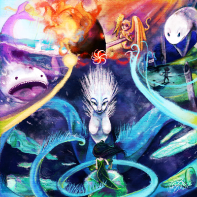
I had the feeling that I had to meet some pretty high expectations when I was called upon to draw this one, so I was pretty nervous about doing it. I spent a long time mulling over how I was going to go about drawing this track art after I completed the art for Stalemate. We don't know nearly as much about the denizens as we do about the kids or the trolls or even the carapacians, but I took what we do know about the beta kids' denizens and ran with it.
Brad Griffin: (booklet editor, booklet commentary)
note: Lunise wrote seven paragraphs about the creative process behind this wonderful art piece. I can only fit the first one on the page.
Unofficial MSPA Fans: (Tumblr)
Here is the full commentary to the rise of the denizens track art. c:
This is the last piece of track art for LOFAM2 that I believe I need to contribute, for The Lovable Tramp’s Rise of the Denizens!
(Continued from booklet commentary)
There were actually a few goofs with the original composition of this drawing - Cetus' tail was originally pointing to the left but I then decided that having it face the right would give the overall drawing more flow. Also in Hephaestus' section of the art I had forgotten that Davesprite was injured when he went to him to get the Deringer repaired so for the longest time he had both wings at their full length. Not much to say about Typheus' section; I had a good idea of what I was going to do with it fairly early on.
Echidna's section is primarily inspired by the track art for Volume 8's Bargaining with the Beast, as far as her design goes. I was originally going to include Jack to the right of Jade in that section, but I didn't find anywhere to put him and I found that the composition looked just fine without him anyway! Although in this memo Jade says that Jack was with him when she was talking with Echidna and I really wanted to draw him, I just couldn't make him fit. Perhaps I'll try and remedy that if I ever make a high-resolution version of this!
I knew immediately that I wanted Echidna to be the main focus out of all the denizens because she's really important in the story since she makes Jade promise to take all the planets, the consorts, the denizens, and everything to the alpha session even if it meant Jade had to die. Then there's Typheus, who's facing doomed John, and Hephaestus looking down on Davesprite and offering him The Choice, and Cetus swimming around in the seas of LOLAR, which is now devoid of fish.
I tried to make the sections flow together the best I could - the top areas where Cetus and Typheus' sections blend into Hephaestus' section kind of fade without any borders, but I decided to make little borders based on each kid's aspect to separate each section from Echidna's section. The breath and light symbols are done in an abstract manner while the time and space symbols are just the straight-up time and space symbols; the space one just overlaps the time one.
I think I've rambled enough about this piece of track art, so I'm going to let the rest speak for itself! I hope I've done a good enough job living up to the LOFAM2 team's expectations, and if I've exceeded them, that's great too!
This has been another rambling commentary from Lune.
(THIS TRACK ALSO CAUSED ME A LOT OF PAIN AND SUFFERING BUT IT WAS MORE LIKE "DEAR GOODNESS WHERE DO ALL THESE LAYERS KEEP COMING FROM" THAN "OH GOD HOW AM I GOING TO COLOR ALL THIS BLACK."
As another side note, the layered .lip file for this had a total of 60 layers not counting the texture layer!
BONUS: When I was starting work on this, instead of copying the texture layer, I accidentally copied Jack over from the layered version of the Stalemate track art. I couldn't bear to delete him from the file, so he got to stay on the condition that his layer stayed invisible. Sometimes I'd make it visible when I was bored! Poor guy just keeps getting chased by things - first an angry PM and now an angry sea denizen!)
#lune draws things once every blue moon #lune is still terrible at commentary but that's okay?
