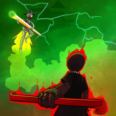
Midnight

By TirantBacon
maxy3
SoundCloud
tirantbacon
SoundCloud
←
7 GRAND END
Previous track by this artist
→
Welcome to Quarantine City
Next track by this artist.
Cover art by Calicorn
calicorn
Tumblr
calicorn
Carrd
←
Radioactive Ore
Previous track art by this artist
→
Commercial Break
Next track art by this artist.
Released 9/9/2017.
Duration: 2:47.
Listen on Bandcamp or YouTube.
Read artist commentary.
Also released as:
- () Midnight (Intermishin)
Tracks that Midnight references: Tracks that this one references:
Artist commentary:
TirantBacon: (composer, booklet commentary)
As an acknowledgement, this song in many ways was mostly inspired by the tune "Black" by Radiation (or Toby Fox I guess). I made this song as a "remix" of sorts of the song called "Midnight Suffers", something I made for the mostly popular fanventure, cool and new web comic. If anything, I'd say it was directly copied from Black, and that I did a mostly poor effort to recreate the style... Nonetheless, I did focus on trying to incorporate some transition points in the song where it would actually deviate from the original arrangement, and I suppose it works quite well even when it's not on paper.
The main motif was taken from midnight suffers... A bluesy jazz type theme that was made with no real direction intended. This song is not necessarily "catchy", but at least it has direction and sounds good, which is always nice! Some of the most prominent instrumentation involved DVS saxophones, loud crazy drums, a heavy bassline, sharp synths and a really loud piano chord progression in the background. It's all crazy stuff.
Calicorn: (track artist, booklet commentary)
I chose Midnight as my track art, mostly just because of my love for Intermission. The song is absolutely fantastic, but since I'm not the most creative person around it took me a while to come up with any concrete designs at first. I was originally going to start off with a 50/50 bust drawing of Slick and Jack, but I soon discovered that might be a little too bland. I ended up listening to the song a dozen more times until I sketched out the base idea for the finalized idea. The main challenge had just been lining everything and getting the perspective to look pretty alright, although I'm not really an expert on perspective or composition. Either way, I'm really happy with how the piece turned out, especailly with the lighting on Slick himself.
