Additional or alternate names:
- Unlabeled Record (earlier MSPA credit)
By Erik Scheele
erikscheele
Bandcamp
erikscheele
SoundCloud
jitters20
Twitter
jitmakesstuff
Tumblr
Jitmakesstuff
YouTube
erikscheele.com
Other
←
Game Over
Previous track by this artist
→
Skaian Shrapnel
Next track by this artist.
Cover art by Killian Ng
cargocollective.com
Other
KLLiiNNG
Twitter
viivus
Tumblr
←
Sweet Dreams, Timaeus
Previous track art by this artist.
Released 8/15/2012.
Duration: 2:36.
Listen on Bandcamp or YouTube.
Download MIDI/project files.
Read artist commentary.
Flashes & games that feature Unlabeled: Flashes & games that feature this track:
Download MIDI/project files:
-
MIDI by i300
- Unlabeled - i300.mid (3.2 kB)
Artist commentary:
Erik Scheele: (booklet commentary)
This is the second of the solo piano pieces on this album, at least in the main tracks, and a really late release as well, given that it first appeared in the comic some time around a year ago. I've held it back from getting released just so it could go on this record, so I'm glad it could finally go out.
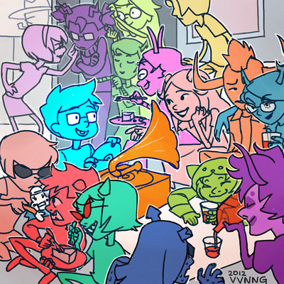
This is also the only piece on the album that doesn't have a specific event to go along with it. Instead, I went for where it appeared in the comic when placing it, and see it as more of a small interlude. The intermission between Act 1 and Act 2 of a musical, if you will. The art is meant to go along with this as well, a sort of non-canon get-together of the first set of trolls and kids we know, and I can imagine them playing this record while they chill.
Killian Ng: (Tumblr, excerpt)
The art for the ‘unlabelled’ track is like a continuation of the cover. From what I remember Jit told me that all of the other tracks refer directly to John at some point in Homestuck, but this one did not. And it’s kind of in the middle of the album so we put that one down as a kind of 'intermission’ track. And by intermission, we apparently mean party with all the characters taking a break from the plot, enjoying cake and not trying to murder each other. Also, the gramophone’s a reference to the page the track appeared on.
Drawing 16 characters (17 if you include Dad in the back) interacting with each other in a small square while keeping them all recognizable AND still having John as the focal point is hard. Which is why the style’s so different from the cover even though it’s meant to be a continuation - I just couldn’t distinguish all the characters from a thumbnail without the solid, bright colours and cutesy style!
Also, I hope you all caught my nod to March Eridan in the back there.

